We lost our biggest client :(
Product designer
Context
The client cited a lack of functionality in the CMS as a large reason for churning. Doug, the product manager for the CMS, found the documentation for their current platform and we audited it to find what they did better. We broke it down into a few problems.
What the competitor did better:
- User roles and permissions (Larger clients seem to always equal larger processes)
- Version control (Drafts, activity log, roll-back)
- Reusable content blocks
1st Problem
Clients want to create workflows around publishing content. For example Teacher A should be able to write up some content but not be allowed to edit the public website without approval from Administrator B. Our existing system assumed that if you had permission to the CMS product, you should be able to post whatever you want. Growing pains.
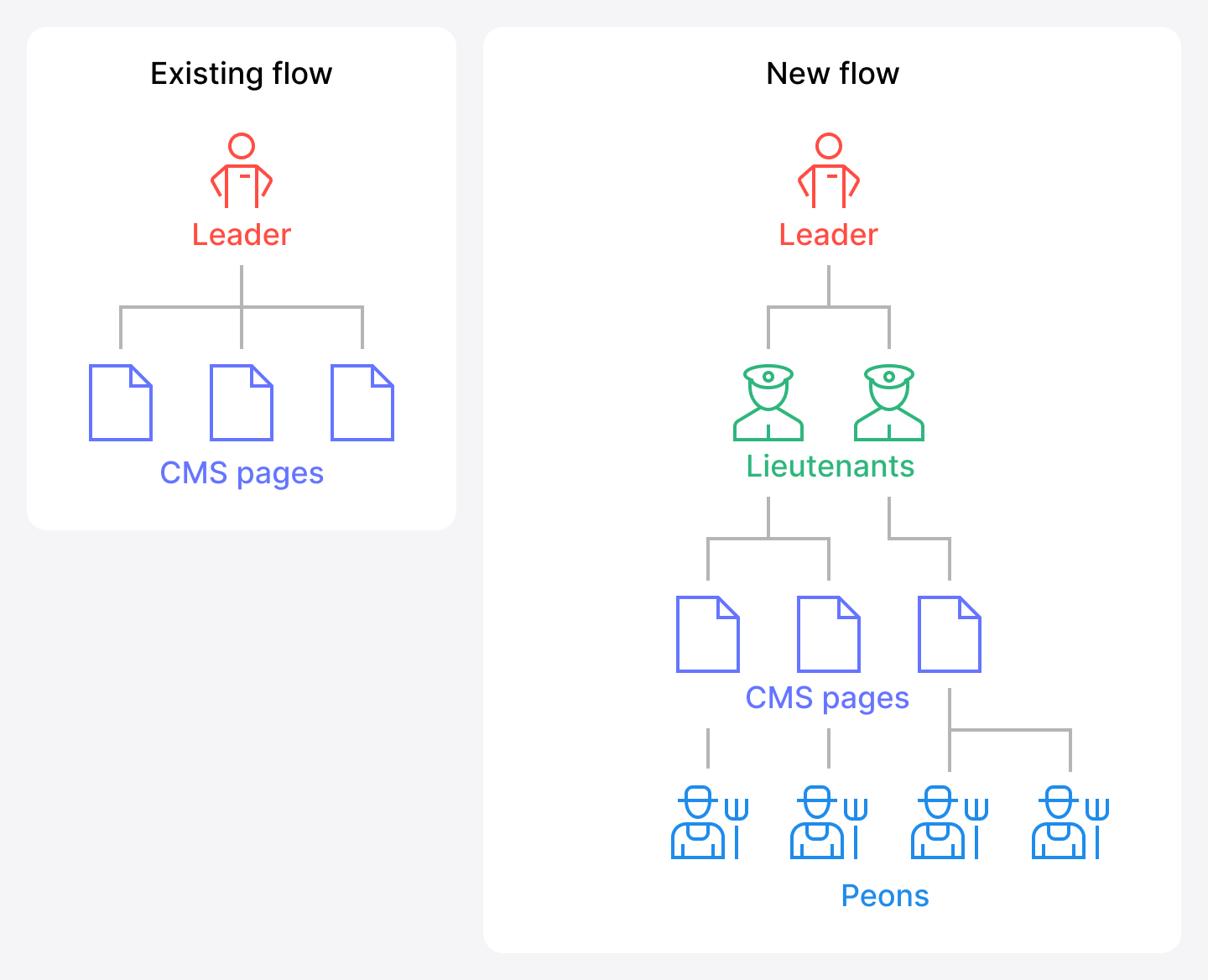
A very abstract version of what we were looking at
1st Solution
On a per-page basis, allow for user permission hierarchy. Or put more simply, make it like sharing a google doc. This is one of those things that feels like a total no brainer, but when the product has been scrapply built on the backs of client success doing background work in an admin panel for years it starts to feel novel.
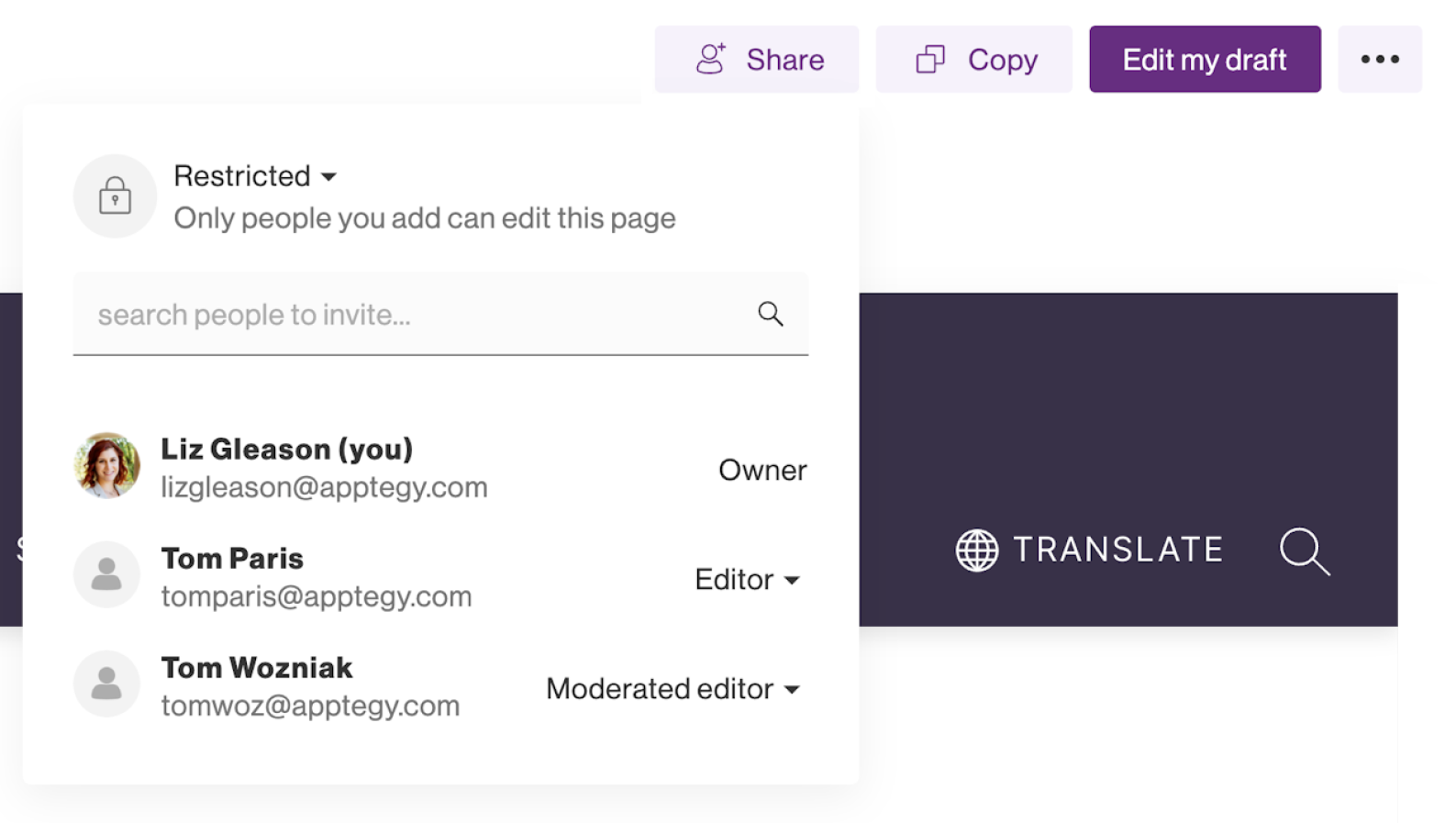
A snippet of the share popover UI
The thing we had to consider most outside of just adopting an industry standard pattern, was making it reusable for the rest of our platform. This consisted of collaborating with back-end engineers on something reusable and with the front-end engineers to get it in our component library (storybook).
2nd Problem
Clients want to not feel like walking on eggshells when updating content on their website. Up to this point, when a page was published it would completely replace the old version with no way to undo the action through the UI. What resulted would be clients frantically coming into support asking if we could recover it, which our killer support team would always do. But that is a lot of friction.
2nd Solution
Introduce a safer way for users to update their content, a la git diff. Include a history log and the ability to roll-back.
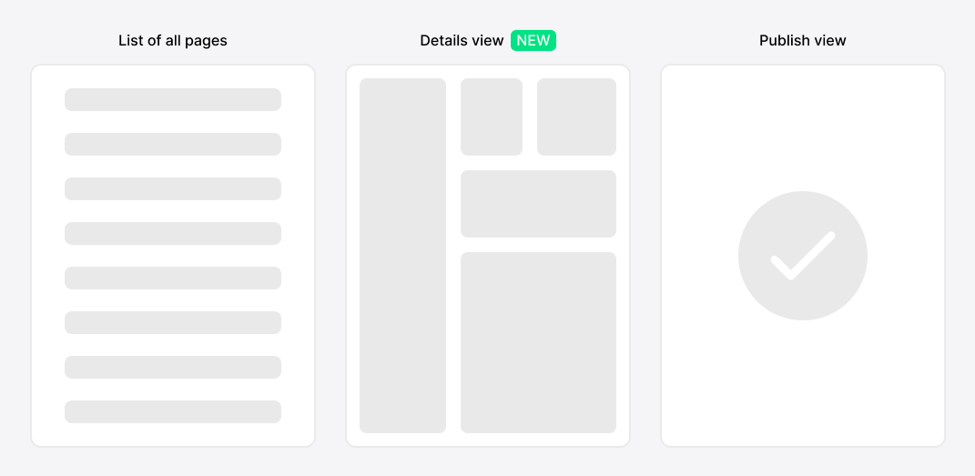
Introduced a details view of a CMS page for all the new features to live
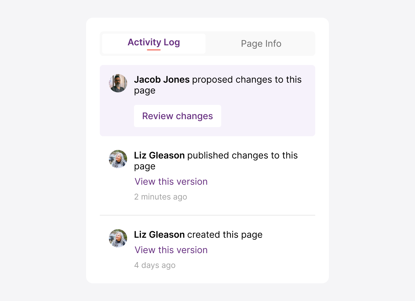
Introduced an Activity Log to keep track of old versions and new proposals
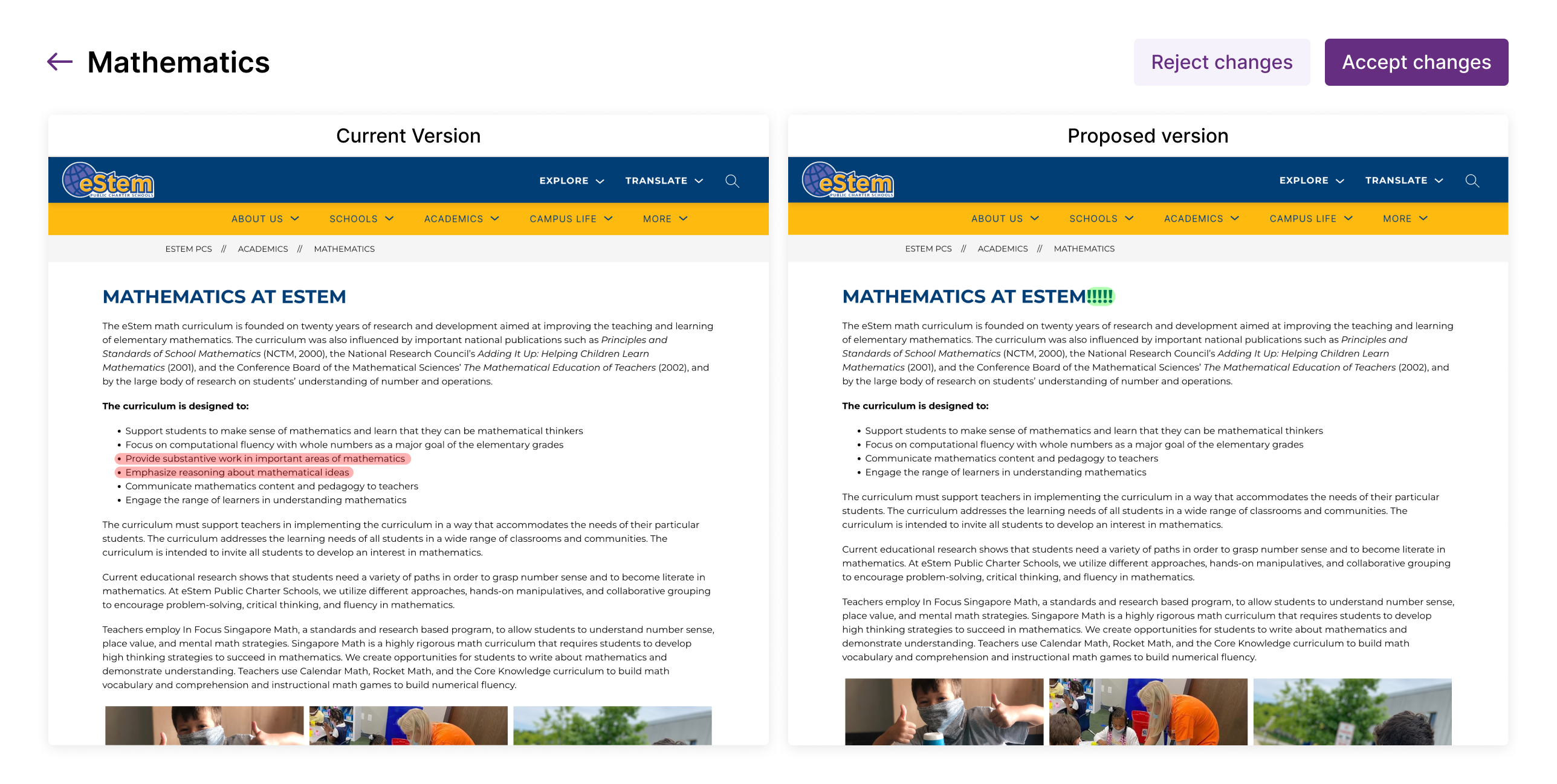
Side by side content comparison
Rollout
These updates were all rolled out together to a couple hand picked clients to test with before a full rollout to all clients.
Impact
-No more support conversations about mistakenly deleted content.
-Creating and sharing pages felt better, that intangible UX vibe.
-Large clients now had the level of control they were asking for.
What I would do differently or like to improve
-Reusable content blocks. We didn't get to it here, but it's just a matter of time.
-In-app notifications would take it up a notch. All page update notifications were via email in v1.
-Multiple approvals per page (like launching a nuke)
-The red and green highlights on changed content never made it to production.